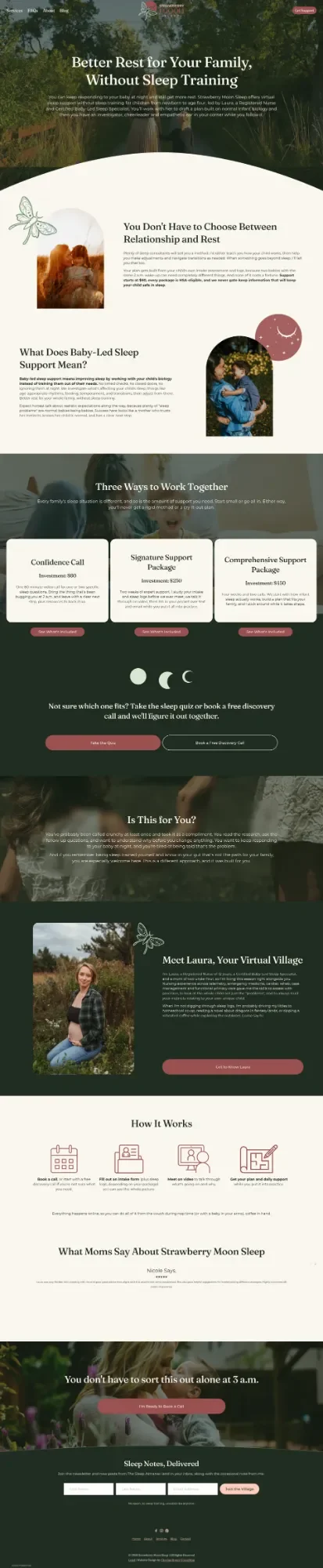
Strawberry Moon Sleep Branding & website Design
Virtual pediatric sleep consulting for attachment-minded families.
Industry: Pediatric Sleep Consulting
Location: Cadott, Wisconsin (virtual practice)
Platform: Squarespace 7.1
Timeline: 6 weeks
Services Provided:
Brand Identity Design (colors, typography, logo direction)
Custom Squarespace website design
Website copywriting
Discovery quiz + patient intake form setup
Tech stack audit and streamlining
Foundational SEO (meta titles, descriptions, Google Search Console, Google Analytics)

Where She Started
Laura Longanecker had just made the leap. After more than a decade as a Registered Nurse, she'd earned her Certified Baby-Led Sleep Specialist credential, built up a real point of view on pediatric sleep, and decided to bet on herself. Strawberry Moon Sleep existed — she had the name, a rough website, and a few clients — but she was still in the phase where passion was outrunning infrastructure. She was giving away her expertise because she wanted to help, and because she didn't yet have the brand or the systems to charge confidently and attract the right people at scale.
The site she was working from wasn't cohesive and wasn't doing the pre-qualification work it needed to do. Without defined brand guidelines, every decision about how to show up online started from zero. She was juggling tools that overlapped in function, dealing with admin fatigue that came from a patchwork setup, and trying to figure out how to grow her client base without spending all her time on discovery calls with families who weren't the right fit.
She had just left her full-time job. She was ready to go live, for real, and she needed a brand, a site, and a back-end that were ready too.
What WE Built
We started with the brand, because everything downstream depends on it. Laura's vision was dark, botanical, celestial, but NOT witchy. We built a palette around a warm canvas off-white and deep evergreen, with terracotta as the hero: the color that leads every button, every header, every brand moment. Peachy, sage, and moss round it out with warmth and botanical depth. Typography followed: Fraunces for headings (display, a little literary, exactly right) and Montserrat for everything else — clean and legible where the headings are expressive. The logo concept centered on a luna moth with a terracotta moon, a motif that felt native to the brand world rather than pulled from a trend. With those decisions made and documented, Laura would never have to start from scratch on a brand question again.
Copy came next. Every page is written in Laura's first-person voice, which meant spending real time inside her intake materials, her testimonials, and the language she naturally reaches for when she talks about sleep. The tone she described as "investigator, cheerleader, and empathetic ear" became the north star for every page. We led with reassurance rather than outcomes, and made sure no page promises a baby who sleeps through the night — because that's not what Laura sells, and putting it in the copy would have undercut everything she stands for. The services page lets parents self-select openly, without an email gate, so the right families can figure out whether they belong before they ever reach out.
On the back end, we mapped what she was actually using, identified where the overlap and friction were, and streamlined the stack around Squarespace, Google Calendar for booking, Stripe for payment processing, MailerLite for email marketing, and Tally for intake forms and quizzes. The goal was a setup where the site handles more of the early-stage client work automatically — intake, scheduling, initial information — so Laura's time stays reserved for the families she's actively working with, as well as her own.
How It's Working
Strawberry Moon Sleep launched with a brand that holds together and a site built to do specific jobs: reflect her philosophy, pre-qualify the right clients, and move people toward booking without putting Laura in the middle of every step. The families who weren't going to be a good fit have a clearer off-ramp before a call ever gets scheduled.
Behind the scenes, Laura has documented brand guidelines, a streamlined tool stack, and a site she can actually maintain and grow from. The blog, branded as The Sleep Almanac, is built to pull organic search traffic over time and give her a place to put her voice to work between client projects. Her email list has its own entry point — "Join the Village" — that fits the practice's whole orientation.
She came in giving away her expertise. She left with the infrastructure to charge what she's worth, attract the right people, and build the practice she left a full-time career to run.